The Influence of Colour
Posted on 28 July, 2020
If an organisation brands itself effectively, it is not unusual for a colour to spring to mind instantly when someone mentions the brand’s name. For example, if someone mentioned ‘Royal Mail’, the famous post box-red comes to mind. It is for this reason that many companies choose to dress their staff in brightly coloured, distinguishable uniforms which will ensure that they stand out to customers – making them more approachable.
However, beyond the initial recognition of the brand, it is interesting to study how different colours make us feel and the impressions that they create in people’s minds. Most of these feelings are evolutionary and have been developed or inherited over time, which means that whilst we can’t change the way that people will feel about certain colours, we can design uniforms around these formed associations to ensure that consumers will feel as positive as possible about your brand, before an interaction has even taken place.
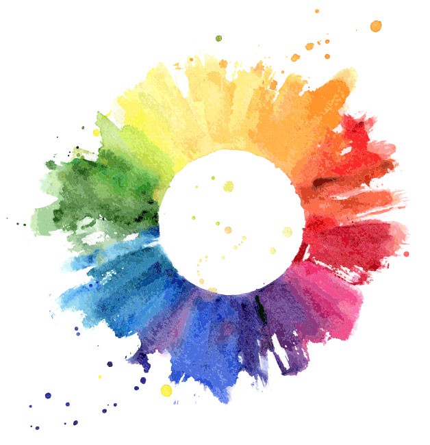
Below is a guideline of colour associations to consider when rebranding or redesigning your new uniform, to ensure that you are sending out an accurate message to your existing and potential customers.
Red
Red is most commonly associated with energy, power and confidence. It is a brilliant colour to wear if you need or want to attract attention, as it quickly stimulates emotions and encourages action. This makes it ideal for organisations that want to convey passion and positivity. Interestingly, red has also been shown to stimulate appetite, which makes it a smart colour to use in the hospitality and catering sectors – it is often seen in restaurants and fast food establishments.
Blue
Blue is the most universally favoured colour and therefore makes it a stable colour to choose for a uniform which a lot of different people are going to see. The colour is known to symbolise trust, reliability and relaxation, making it a suitable colour for almost any organisation, as it is a universal goal to be seen as trustworthy and reliable in order to build a loyal customer base. However, it is a particularly suitable colour to use for uniforms within the finance, healthcare and trade industries.
Green
Often seen as the colour of nature, green is most commonly associated with things such as growth, vitality and the environment. It is therefore perfect for industries associated with the outdoors or natural products, such as greengrocers and energy providers. Unlike other colours, green has very few negative connotations and has been shown to inspire creativity and productivity, as it is a restful colour for eyes. The colour green is also a common choice for those that work with animals, such as vets, due to its calming and natural effect.
Orange
A colour of stimulation and enthusiasm, orange has been proved to produce an energising effect as it increases oxygen supply to the brain. However, it also represents warmth and happiness and interestingly, affordability. This makes it a good colour for low-cost companies, or those which want to give the impression of being affordable. It is often associated with adventure, so is also a good choice for travel and leisure companies.
Pink
A symbol of warmth, stability and tranquillity, pink is an ideal colour for the beauty and cosmetics industries. With its calming effect, pink is a great colour for those that need to evoke empathy. Although it has traditionally been known as a feminine colour, pink is becoming more popular for mens’ uniforms – particularly in the corporate industries.
Yellow
Perhaps the brightest colour on the spectrum, yellow has a warming effect and is known to encourage creativity, cheerfulness and positivity. It has also been shown to evoke a strong psychological response, which is why it is often seen with charities’ branding and uniforms. Having said that, it is not the most popular colour and therefore it is probably a good idea to use yellow sparingly within most uniforms.
Purple
Known as the colour of royalty, purple is most widely associated with sophistication, wealth and prosperity. It can sometimes be seen to show that products or services are expensive and therefore customers can be wary of the colour, when it is seen within branding or packaging. However, when used sparingly, purple gives the impression of high quality and exclusivity. This makes it a particularly effective colour when used within the travel, beauty and hospitality industries.
Black
Black is a colour which can evoke very different feelings, depending upon the context within which it is used. Whilst it is often viewed as a stylish and dignified colour, it can also show oppression and negativity. Either way, it exerts authority and control, making it a popular colour choice within the security and funeral care sectors. However, due to its timelessness and sophistication, it is also commonly used in retail uniforms. It is often a good idea to introduce brighter flashes of colour to black uniforms to break up the harsh appearance.
White
Quite the opposite to black, white represents purity and light. It is often used with the catering and medical professions, as it is seen to be a sign of hygiene and cleanliness. Whilst some see white as an inspiration for creativity, as it represents a blank canvas, it can sometimes be viewed as bland or uninteresting, so it may be a good idea to use in conjunction with other colours.
Whilst this advice has been formed on the basis of research, these are guidelines only. The most powerful uniforms will always be those that portray your brand ideals and values accurately. For more information or to discuss your next uniform, please contact us on hello@dimensions.co.uk or call 01332 697045.
Recent Articles
FutureFest 2025: A Day of Adventure with the Greggs Foundation
Dimensions Secures Exciting New Partnership with Avis Budget Group for Bespoke Uniform Range
Future Hotel Manager Leila Gets Her Very Own Mini Uniform (and Teddy!)
Dimensions Donates 40 Pairs of Shoes to Support Children in Need
A First Look at the New Nationwide Uniform With a Bit of Show and Tell